Components
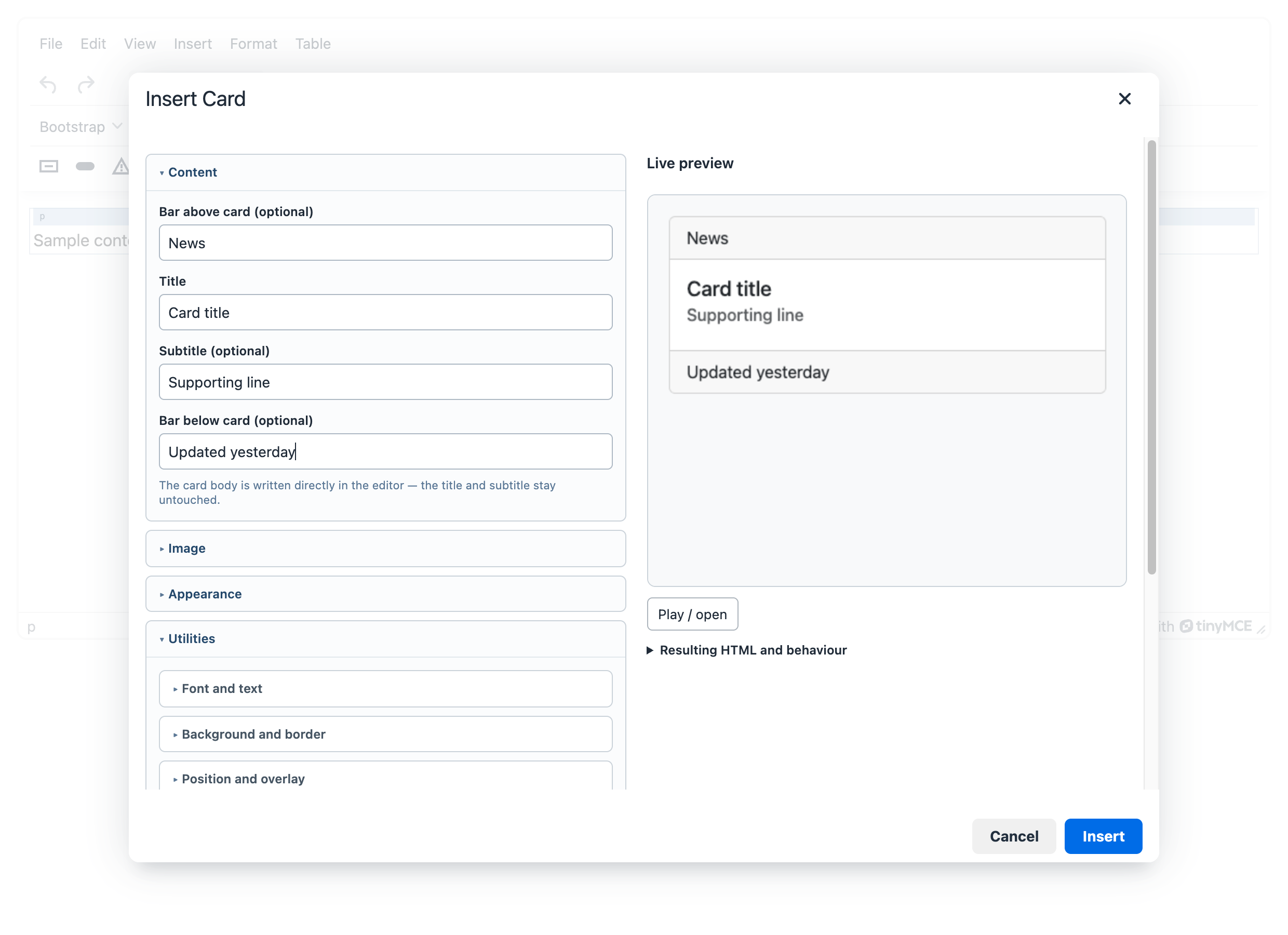
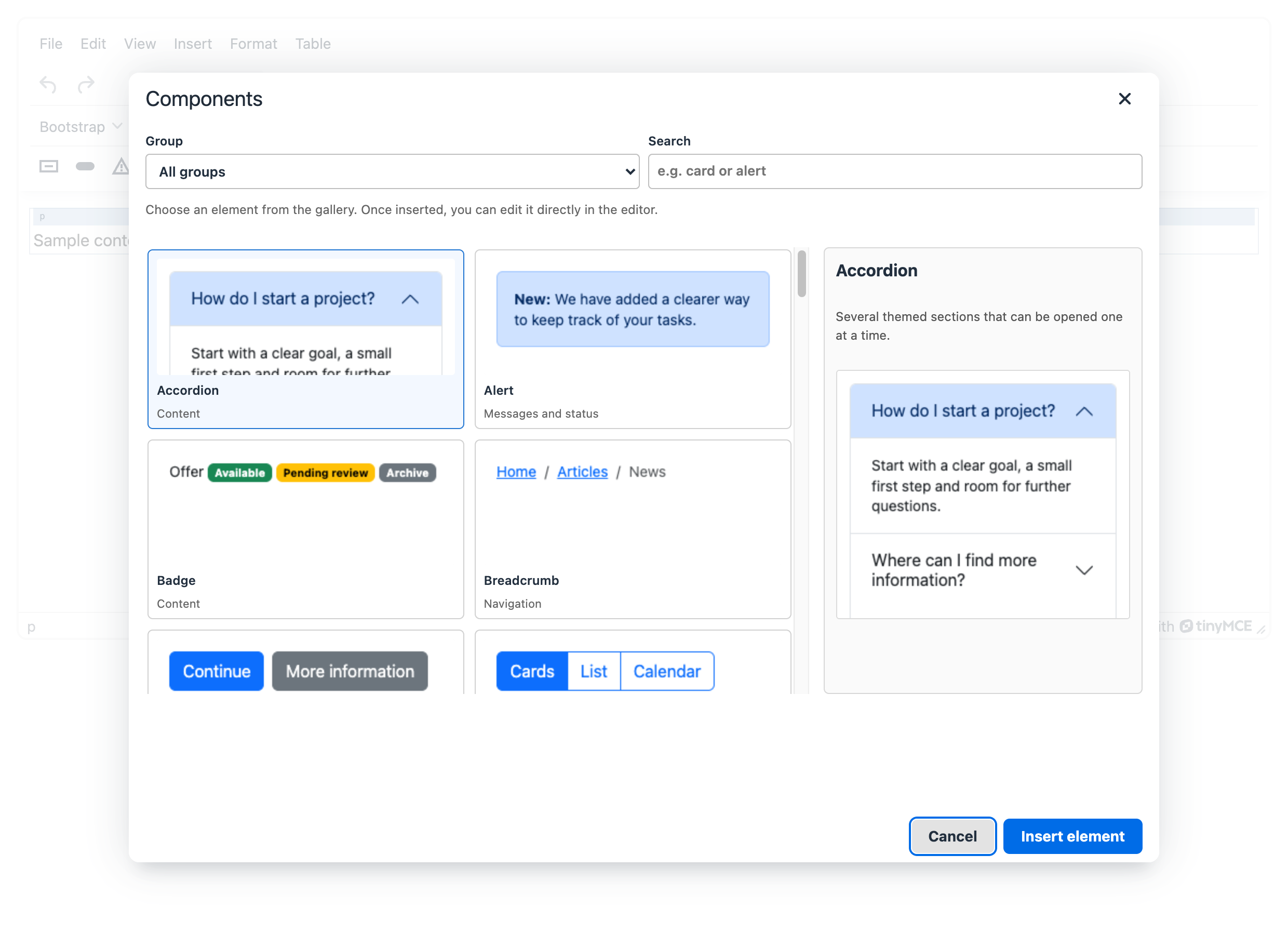
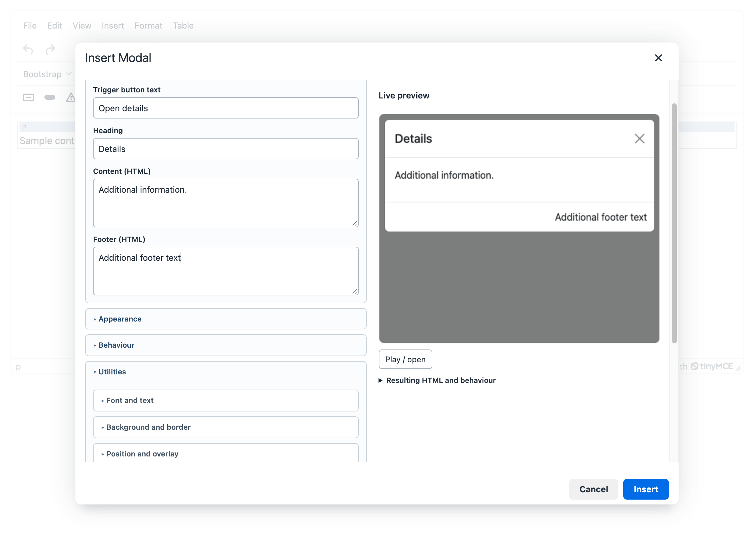
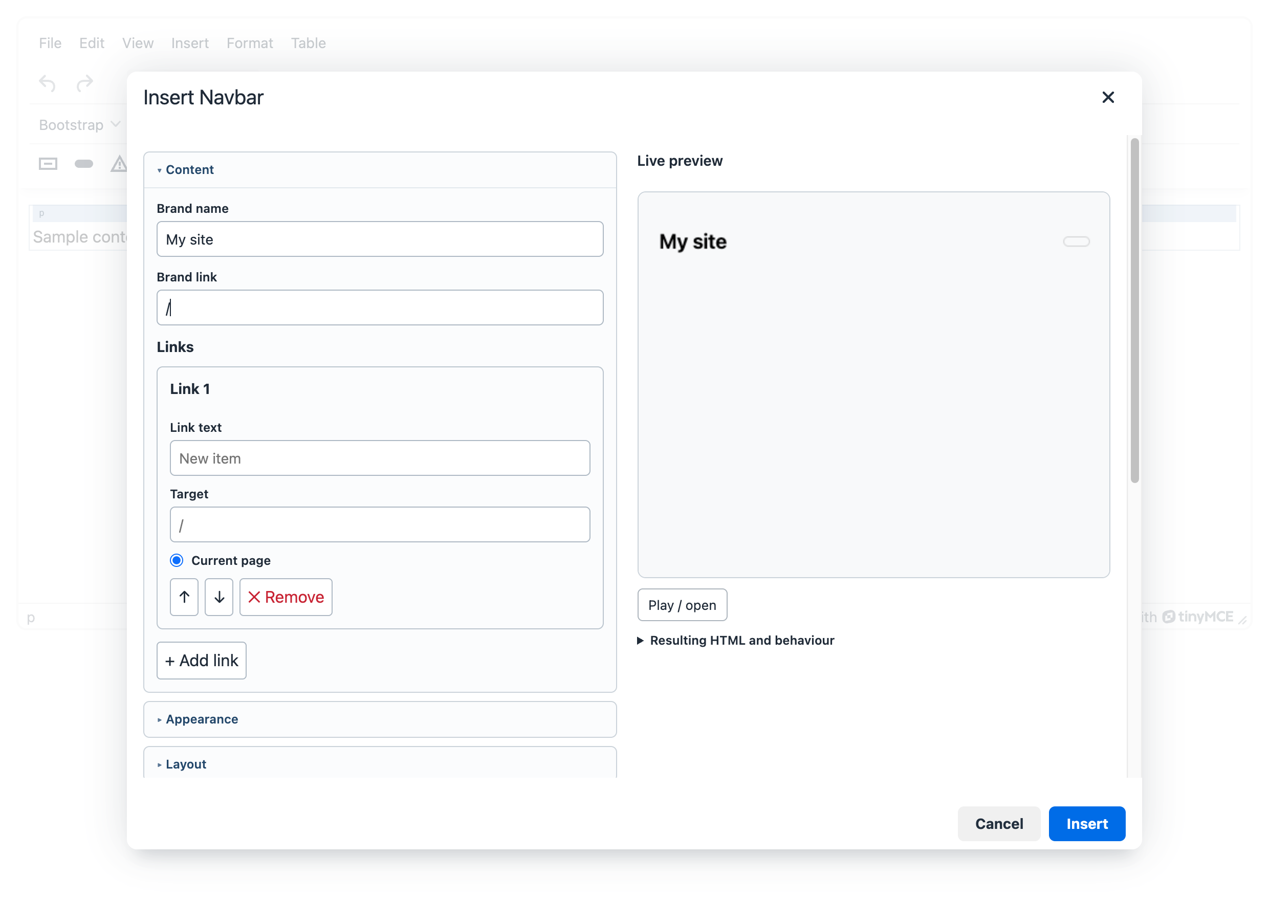
Each dialog uses the same layout: settings in collapsible sections on the left (Content, Appearance, Behaviour, Advanced, Utilities), a live preview and the resulting HTML on the right. When inserting a component, fields show example placeholders. When editing one, they show its current values.
Click into an inserted component and the context toolbar offers Edit element, Edit parent element, paragraph above/below and Remove.
What a dialog looks like
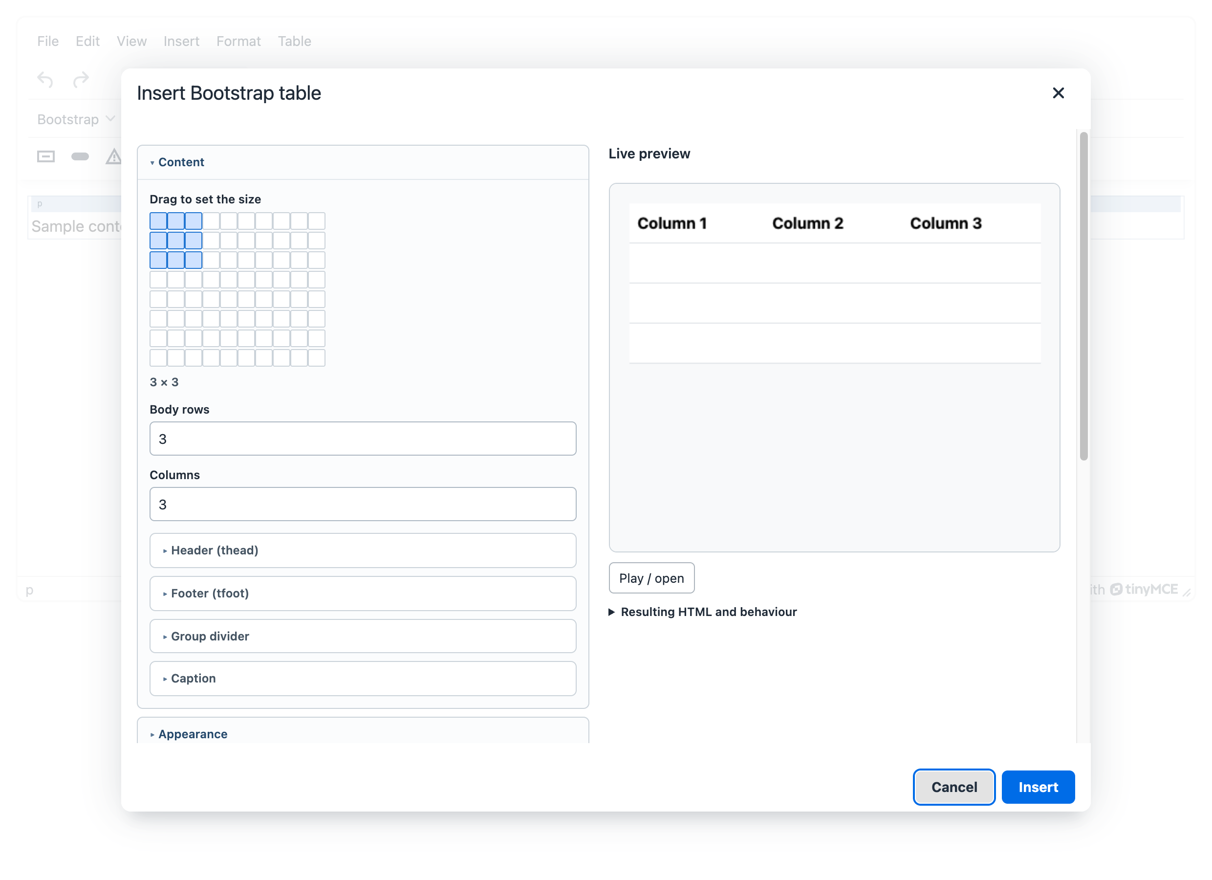
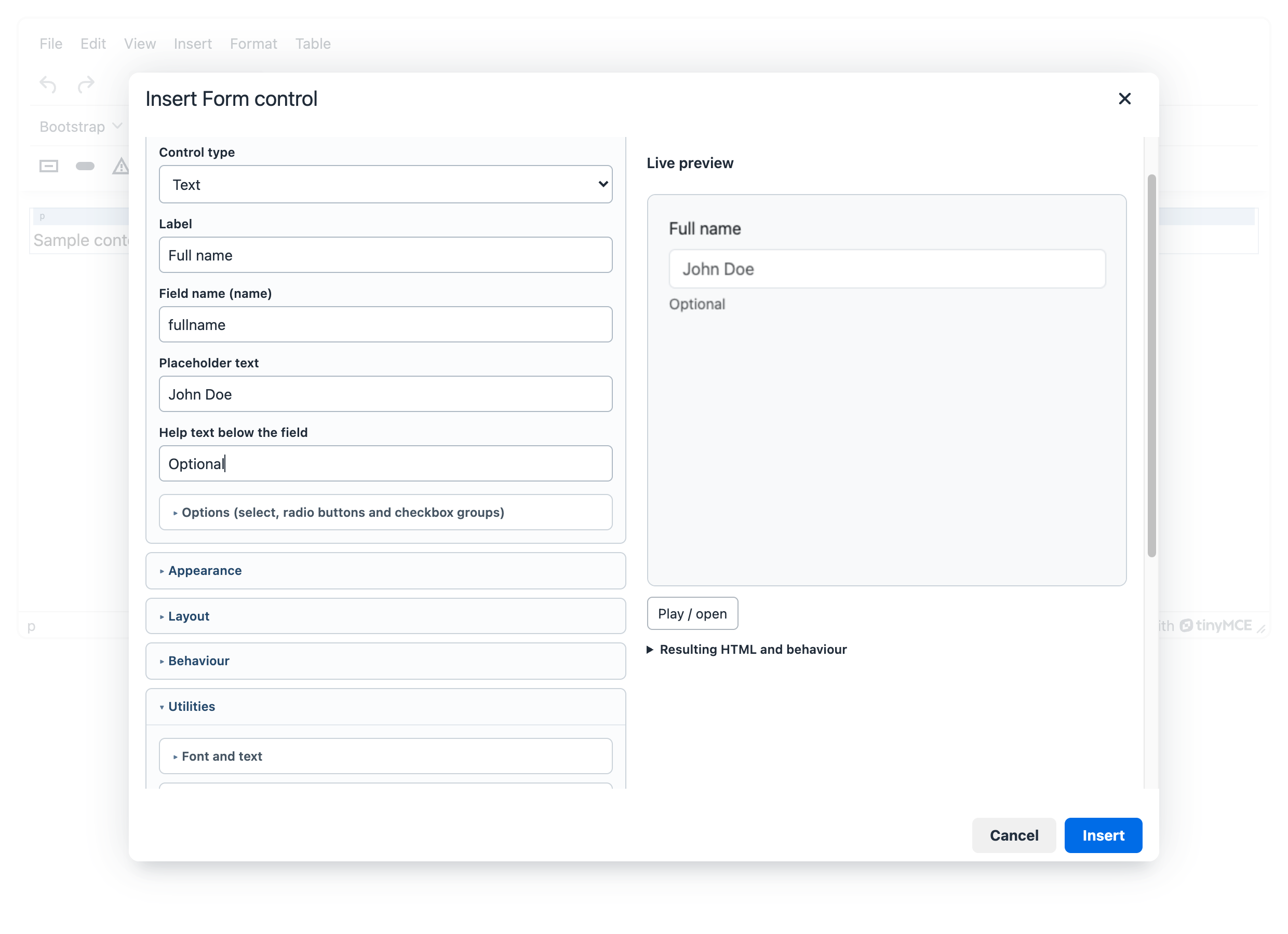
| Dialog | Inserts | Notes |
|---|---|---|
| Alert | .alert with optional heading, close button, fade |
Text is edited directly in the editor. |
| Badge | .badge.text-bg-* |
Inserted at the caret, inline. |
| Button | <a class="btn"> or <button> |
Outline, size, disabled with correct ARIA. |
| Button group | .btn-group |
Plain buttons or checkbox/radio toggles (toggles are not offered on Bootstrap 4). |
| Card | .card with header, title, subtitle, image, footer |
Body written in the editor. Image on top, bottom, overlay or horizontal. |
| List group | .list-group |
Numbered, flush, horizontal from a breakpoint, per-item colour and state. |
| Progress | .progress |
Striped, animated, stacked bars. |
| Spinner | .spinner-border / .spinner-grow |
Screen-reader text required. |
| Accordion | .accordion |
Items with rich content edited in the editor. Bootstrap 5 only. |
| Pagination, Breadcrumb | <nav> wrappers |
Disabled arrows drop out of the tab order. |
| Navs and tabs | .nav + .tab-content |
Switch panes with the context toolbar arrows. |
| Navbar | .navbar |
Brand, links, expand breakpoint, colour mode, placement. |
| Scrollspy | navigation + scrollable area | Sections edited in the editor. |
| Toast, Modal, Offcanvas | component + trigger button | Shown framed and labelled hidden on the website in the editor. The Modal’s header (without it, screen readers announce the modal by its heading), close cross, body and footer can each be switched off; the footer can get a Close button with your own text. Offcanvas is Bootstrap 5 only; on version 4 the plugin offers no full-screen variants for the Modal and no placement for the Toast. |
| Tooltip, Popover | trigger with data-bs-* |
Placement, offset, delays, HTML content. |
| Dropdown, Collapse | trigger + panel | Direction, auto-close, horizontal collapse. |
| Carousel | .carousel |
Slides authored in the editor; switch with the context toolbar arrows. |
| Table | .table (+ .table-responsive) |
Header/footer rows, stripes, borders; rows and merging via TinyMCE’s table tools. |
| Table cell | classes on td/th |
Apply to one cell, the row, the column or all cells. |
| Figure | <figure> with caption |
Thumbnail, fluid, float, width. |
| Typography | heading, paragraph, blockquote | Display sizes, lead, alignment. |
| Form control | label + input/select/textarea/check | Floating labels, input groups, validation states. |
| Placeholder | .placeholder lines |
Width, size, animation. Bootstrap 5 only. |
| Ratio | .ratio frame (.embed-responsive on version 4) |
Video or map embeds that keep their aspect ratio. |
| Close button | .btn-close or a button with text (.btn) |
Inside a modal, offcanvas, alert or toast it closes that component by default (no ID needed); otherwise pick the element it closes by clicking in the editor. Looks like a cross or like a regular button (colour, outline, size). |
| Container, Custom classes | .container*; any classes on any element |
Content inside components
The body of a modal, card, collapse, alert, accordion, toast, offcanvas and table cell is kept when you save the dialog, including tables, quotes, images with captions and inline styles. HTML entered in a dialog is filtered by the same rules as the editor content (the TinyMCE schema, valid_elements, XSS protection): what the editor does not accept in the source code, the dialog does not accept either. To allow another element or attribute in component content, allow it in your TinyMCE configuration.
What saving a dialog keeps and what it rebuilds
Saving replaces the whole component, so the dialog rebuilds what it controls and carries over the rest.
Kept as it was
- The rich content of the bodies (lists, links, formatting, images, nested blocks).
- On a card: the header, title, subtitle and footer including their formatting, as long as you do not change that field in the dialog. A field you edit becomes plain text in the original tag (an
h5title stays anh5). Other parts of the card, such as a second body or a list group, stay in their original order. - Attributes on the outermost element that the dialog has no field for, for example
style,data-*,title,lang. They are filtered by the same rules as the content. An option you switch off in the dialog stays off. widthandheightof the card image. When you change the image address, the old dimensions andsrcsetare dropped, because they would not fit the new image.- Collapse and accordion panels without the usual wrapper (
card-body,accordion-body): the whole panel is the content and the dialog does not add a wrapper.
Generated again from the dialog
- The structure the dialog manages itself: trigger buttons, modal header and close button, indicators and arrows, IDs, ARIA attributes, data attributes and classes controlled by the dialog settings. Classes you wrote by hand stay among the custom classes.
- Manually added markup inside this structure (outside the editable bodies) may be lost on save. Edit it in the source code.
Bootstrap 4
With bootstrapui_version: '4' Accordion, Offcanvas and Placeholder have no toolbar button or menu item; the command (for example BootstrapUiOffcanvas) shows a message that the component is not in this series. You therefore do not need separate toolbar configurations, TinyMCE drops an unknown button. The other differences are listed in Requirements.