Basic usage
This chapter is for the people who write content in the editor. It assumes the plugin is installed as described in Quick start and the buttons are in the toolbar (the reference configuration adds all of them).
Insert a component
- Put the cursor where the component should go.
- Click its button in the toolbar, for example Card. The same dialogs are in the Insert menu, in the Bootstrap drop-down (
bootstrapui) and in the Components gallery, which shows every component as a live preview. - Fill in the dialog. Settings are on the left in collapsible sections (Content, Appearance, Behaviour, Advanced, Utilities). The live preview and the resulting HTML are on the right and change as you type. Empty fields show example placeholders.
- Click Insert. The component lands at the cursor as plain Bootstrap HTML.
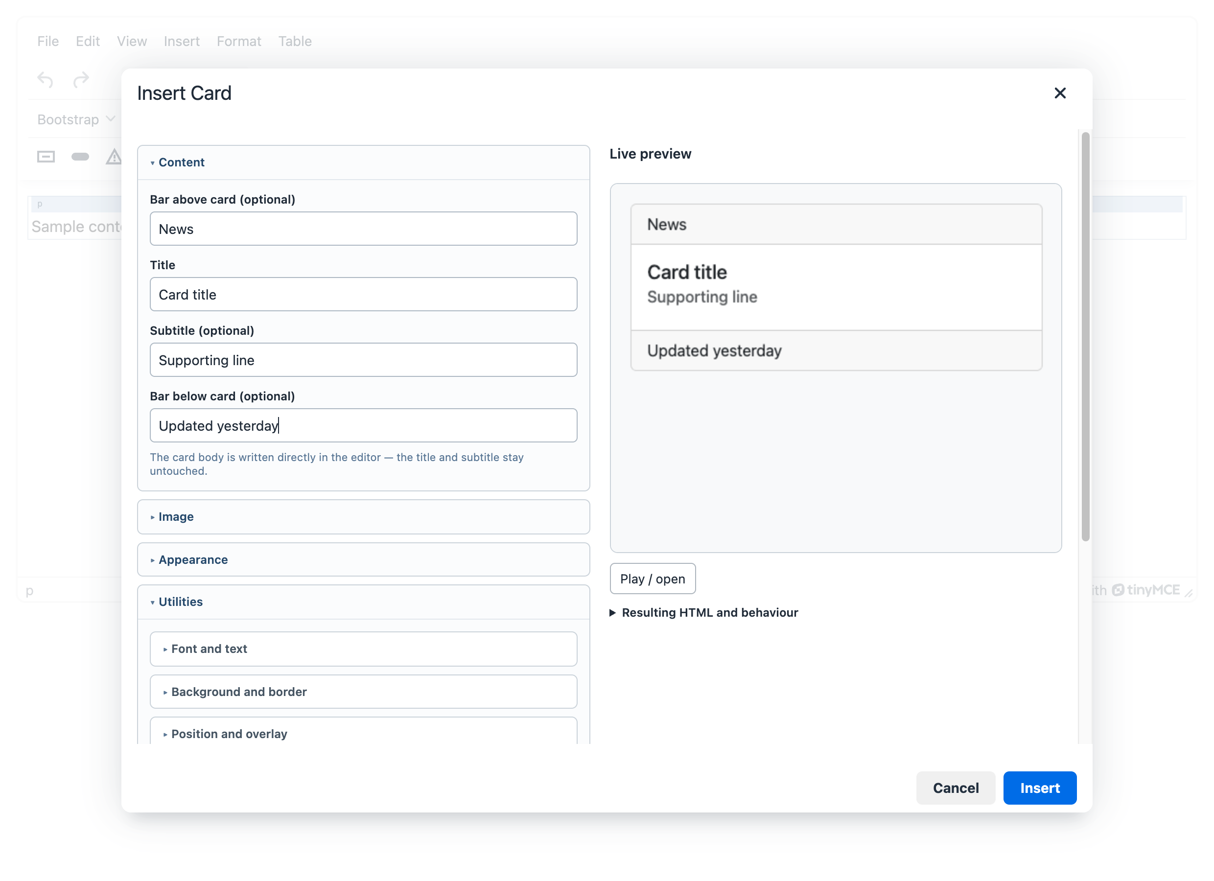
Interactive components (modal, offcanvas, toast, collapse, dropdown, tooltip, popover) are inserted together with the button that opens them. Components that are hidden on the page, such as a modal, are drawn framed and labelled in the editing area, so you can edit their content. Play / open in the preview shows how they behave; it needs bootstrapui_js in the configuration.
Edit a component
- Click anywhere inside the component. A context toolbar appears next to it. Its first item names what is selected (for example Card).
- Click the pencil, Edit element. The same dialog opens with the current values.
- Change what you need and click Save.
Text inside components (the body of a card, the message of an alert) can also be typed directly in the editing area, without a dialog.
The context toolbar has more tools:
| Tool | What it does |
|---|---|
| Edit parent element | Opens the dialog of the component around the current one, for example the card around a button. |
| Edit button group | On a button inside a group: settings of the whole group. |
| Paragraph above element / Paragraph below element | Adds an empty paragraph next to the component, so you can keep writing. |
| p ⇄ div | Switches the block between a paragraph and a div. |
| Remove element | Deletes the component. |
| Previous slide / Next slide, Previous pane / Next pane | In a carousel or in tabs: shows another slide or pane for editing. |
Above the first component and between two components there is often no place for the cursor. Point at the gap and a blue + Paragraph strip appears; click it to add a paragraph there.
Build a page layout
- Click Insert layout (
bootstrapuilayout). - In the grid designer, choose the number of columns, switch breakpoints to preview the layout on different screens, drag columns to change their order and click a column for its width, offset and alignment.
- Click Insert. You get a
.rowwith.col-*columns; write into the columns as usual.
Click into a row or a column and its own context toolbar appears: add, edit, duplicate, move and remove. Select row or column (bootstrapuipath) picks the right one in nested grids. Show layout outlines (bootstrapuistructure) draws the rows and columns in the editing area without changing the saved HTML. Details are in Grid designer.
Add Bootstrap classes
- Styles menu. Select text or put the cursor in a block, open Styles and choose from the Bootstrap group: colours, font size, spacing, borders, display. Choosing a ticked value removes it. See Utilities.
- Utilities in every dialog. Each component dialog has a Utilities section for spacing, sizing, display, flexbox, colours, borders and text.
- Custom classes (
bootstrapuiclasses). Adds any classes to the element under the cursor, including classes of your own theme.
Tables
Bootstrap table (bootstrapuitable) inserts a table with Bootstrap classes: stripes, borders, colour tint, header style, compact rows, row highlight on hover, a caption and horizontal scrolling on narrow screens. Rows, columns and merged cells are edited with TinyMCE’s own table tools. The Table menu (bootstrapuitablemenu) puts them in one place, together with Table cell settings (colour tint, vertical alignment, header cell), which apply to one cell, a row, a column or the whole table.
What gets saved
The editor saves ordinary Bootstrap HTML: no shortcodes, no wrapper elements and no inline styles. Your website shows it with its own Bootstrap stylesheet. If you remove the plugin, the content stays valid. Classes the plugin does not recognise are kept when you edit a component.